Joanne E McKenzie, Sue E Brennan
Key Points:
- Meta-analysis of effect estimates has many advantages, but other synthesis methods may need to be considered in the circumstance where there is incompletely reported data in the primary studies.
- Alternative synthesis methods differ in the completeness of the data they require, the hypotheses they address, and the conclusions and recommendations that can be drawn from their findings.
- These methods provide more limited information for healthcare decision making than meta-analysis, but may be superior to a narrative description where some results are privileged above others without appropriate justification.
- Tabulation and visual display of the results should always be presented alongside any synthesis, and are especially important for transparent reporting in reviews without meta-analysis.
- Alternative synthesis and visual display methods should be planned and specified in the protocol. When writing the review, details of the synthesis methods should be described.
- Synthesis methods that involve vote counting based on statistical significance have serious limitations and are unacceptable.
Cite this chapter as: McKenzie JE, Brennan SE. Chapter 12: Synthesizing and presenting findings using other methods [last updated October 2019]. In: Higgins JPT, Thomas J, Chandler J, Cumpston M, Li T, Page MJ, Welch VA (editors). Cochrane Handbook for Systematic Reviews of Interventions version 6.5. Cochrane, 2024. Available from cochrane.org/handbook.
12.1 Why a meta-analysis of effect estimates may not be possible
Meta-analysis of effect estimates has many potential advantages (see Chapter 10 and Chapter 11). However, there are circumstances where it may not be possible to undertake a meta-analysis and other statistical synthesis methods may be considered (McKenzie and Brennan 2014).
Some common reasons why it may not be possible to undertake a meta-analysis are outlined in Table 12.1.a. Legitimate reasons include limited evidence; incompletely reported outcome/effect estimates, or different effect measures used across studies; and bias in the evidence. Other commonly cited reasons for not using meta-analysis are because of too much clinical or methodological diversity, or statistical heterogeneity (Achana et al 2014). However, meta-analysis methods should be considered in these circumstances, as they may provide important insights if undertaken and interpreted appropriately.
Table 12.1.a Scenarios that may preclude meta-analysis, with possible solutions
|
Scenario |
Description |
Examples of possible solutions* |
|
Limited evidence for a pre-specified comparison |
Meta-analysis is not possible with no studies, or only one study. This circumstance may reflect the infancy of research in a particular area, or that the specified PICO for the synthesis aims to address a narrow question. |
Build contingencies into the analysis plan to group one or more of the PICO elements at a broader level (Chapter 2, Section 2.5.3). |
|
Incompletely reported outcome or effect estimate |
Within a study, the intervention effects may be incompletely reported (e.g. effect estimate with no measure of precision; direction of effect with P value or statement of statistical significance; only the direction of effect). |
Calculate the effect estimate and measure of precision from the available statistics if possible (Chapter 6). Impute missing statistics (e.g. standard deviations) where possible (Chapter 6, Section 6.5.2). Use other synthesis method(s) (Section 12.2), along with methods to display and present available effects visually (Section 12.3). |
|
Different effect measures |
Across studies, the same outcome could be treated differently (e.g. a time-to-event outcome has been dichotomized in some studies) or analysed using different methods. Both scenarios could lead to different effect measures (e.g. hazard ratios and odds ratios). |
Calculate the effect estimate and measure of precision for the same effect measure from the available statistics if possible (Chapter 6). Transform effect measures (e.g. convert standardized mean difference to an odds ratio) where possible (Chapter 10, Section 10.6). Use other synthesis method(s) (Section 12.2), along with methods to display and present available effects visually (Section 12.3). |
|
Bias in the evidence |
Concerns about missing studies, missing outcomes within the studies (Chapter 13), or bias in the studies (Chapter 8 and Chapter 25), are legitimate reasons for not undertaking a meta-analysis. These concerns similarly apply to other synthesis methods (Section 12.2). |
When there are major concerns about bias in the evidence, use structured reporting of the available effects using tables and visual displays (Section 12.3).
|
|
Incompletely reported outcomes/effects may bias meta-analyses, but not necessarily other synthesis methods. |
For incompletely reported outcomes/effects, also consider other synthesis methods in addition to meta-analysis (Section 12.2). |
|
|
Clinical and methodological diversity |
Concerns about diversity in the populations, interventions, outcomes, study designs, are often cited reasons for not using meta-analysis (Ioannidis et al 2008). Arguments against using meta-analysis because of too much diversity equally apply to the other synthesis methods (Valentine et al 2010). |
Modify planned comparisons, providing rationale for post-hoc changes (Chapter 9). |
|
Statistical heterogeneity |
Statistical heterogeneity is an often cited reason for not reporting the meta-analysis result (Ioannidis et al 2008). Presentation of an average combined effect in this circumstance can be misleading, particularly if the estimated effects across the studies are both harmful and beneficial. |
Attempt to reduce heterogeneity (e.g. checking the data, correcting an inappropriate choice of effect measure) (Chapter 10, Section 10.10). Attempt to explain heterogeneity (e.g. using subgroup analysis) (Chapter 10, Section 10.11). Consider (if possible) presenting a prediction interval, which provides a predicted range for the true intervention effect in an individual study (Riley et al 2011), thus clearly demonstrating the uncertainty in the intervention effects. |
|
*Italicized text indicates possible solutions discussed in this chapter. |
||
12.2 Statistical synthesis when meta-analysis of effect estimates is not possible
A range of statistical synthesis methods are available, and these may be divided into three categories based on their preferability (Table 12.2.a). Preferable methods are the meta-analysis methods outlined in Chapter 10 and Chapter 11, and are not discussed in detail here. This chapter focuses on methods that might be considered when a meta-analysis of effect estimates is not possible due to incompletely reported data in the primary studies. These methods divide into those that are ‘acceptable’ and ‘unacceptable’. The ‘acceptable’ methods differ in the data they require, the hypotheses they address, limitations around their use, and the conclusions and recommendations that can be drawn (see Section 12.2.1). The ‘unacceptable’ methods in common use are described (see Section 12.2.2), along with the reasons for why they are problematic.
Compared with meta-analysis methods, the ‘acceptable’ synthesis methods provide more limited information for healthcare decision making. However, these ‘acceptable’ methods may be superior to a narrative that describes results study by study, which comes with the risk that some studies or findings are privileged above others without appropriate justification. Further, in reviews with little or no synthesis, readers are left to make sense of the research themselves, which may result in the use of seemingly simple yet problematic synthesis methods such as vote counting based on statistical significance (see Section 12.2.2.1).
All methods first involve calculation of a ‘standardized metric’, followed by application of a synthesis method. In applying any of the following synthesis methods, it is important that only one outcome per study (or other independent unit, for example one comparison from a trial with multiple intervention groups) contributes to the synthesis. Chapter 9 outlines approaches for selecting an outcome when multiple have been measured. Similar to meta-analysis, sensitivity analyses can be undertaken to examine if the findings of the synthesis are robust to potentially influential decisions (see Chapter 10, Section 10.14 and Section 12.4 for examples).
Authors should report the specific methods used in lieu of meta-analysis (including approaches used for presentation and visual display), rather than stating that they have conducted a ‘narrative synthesis’ or ‘narrative summary’ without elaboration. The limitations of the chosen methods must be described, and conclusions worded with appropriate caution. The aim of reporting this detail is to make the synthesis process more transparent and reproducible, and help ensure use of appropriate methods and interpretation.
Table 12.2.a Summary of preferable and acceptable synthesis methods
|
Synthesis method |
Question answered |
Minimum data required |
Purpose |
Limitations |
|||||
|
|
|
Estimate of effect |
Variance |
Direction of effect |
Precise P value |
|
|
||
|
Preferable |
|||||||||
|
Meta-analysis of effect estimates and extensions (Chapter 10 and Chapter 11) |
What is the common intervention effect? What is the average intervention effect? Which intervention, of multiple, is most effective? What factors modify the magnitude of the intervention effects? |
✓ |
✓ |
Can be used to synthesize results when effect estimates and their variances are reported (or can be calculated). Provides a combined estimate of average intervention effect (random effects), and precision of this estimate (95% CI). Can be used to synthesize evidence from multiple interventions, with the ability to rank them (network meta-analysis). Can be used to detect, quantify and investigate heterogeneity (meta-regression/subgroup analysis). Associated plots: forest plot, funnel plot, network diagram, rankogram plot |
Requires effect estimates and their variances. Extensions (network meta-analysis, meta-regression/subgroup analysis) require a reasonably large number of studies. Meta-regression/subgroup analysis involves observational comparisons and requires careful interpretation. High risk of false positive conclusions for sources of heterogeneity. Network meta-analysis is more complicated to undertake and requires careful assessment of the assumptions. |
||||
|
Acceptable |
|||||||||
|
Summarizing effect estimates |
What is the range and distribution of observed effects? |
✓ |
Can be used to synthesize results when it is difficult to undertake a meta-analysis (e.g. missing variances of effects, unit of analysis errors). Provides information on the magnitude and range of effects (median, interquartile range, range). Associated plots: box-and-whisker plot, bubble plot |
Does not account for differences in the relative sizes of the studies. Performance of these statistics applied in the context of summarizing effect estimates has not been evaluated. |
|||||
|
Combining P values |
Is there evidence that there is an effect in at least one study? |
✓ |
✓ |
Can be used to synthesize results when studies report:
Associated plot: albatross plot |
Provides no information on the magnitude of effects. Does not distinguish between evidence from large studies with small effects and small studies with large effects. Difficult to interpret the test results when statistically significant, since the null hypothesis can be rejected on the basis of an effect in only one study (Jones 1995). When combining P values from few, small studies, failure to reject the null hypotheses should not be interpreted as evidence of no effect in all studies. |
||||
|
Vote counting based on direction of effect |
Is there any evidence of an effect? |
✓ |
Can be used to synthesize results when only direction of effect is reported, or there is inconsistency in the effect measures or data reported across studies. Associated plots: harvest plot, effect direction plot |
Provides no information on the magnitude of effects (Borenstein et al 2009). Does not account for differences in the relative sizes of the studies (Borenstein et al 2009). Less powerful than methods used to combine P values. |
|||||
12.2.1 Acceptable synthesis methods
12.2.1.1 Summarizing effect estimates
Description of method Summarizing effect estimates might be considered in the circumstance where estimates of intervention effect are available (or can be calculated), but the variances of the effects are not reported or are incorrect (and cannot be calculated from other statistics, or reasonably imputed) (Grimshaw et al 2003). Incorrect calculation of variances arises more commonly in non-standard study designs that involve clustering or matching (Chapter 23). While missing variances may limit the possibility of meta-analysis, the (standardized) effects can be summarized using descriptive statistics such as the median, interquartile range, and the range. Calculating these statistics addresses the question ‘What is the range and distribution of observed effects?’
Reporting of methods and results The statistics that will be used to summarize the effects (e.g. median, interquartile range) should be reported. Box-and-whisker or bubble plots will complement reporting of the summary statistics by providing a visual display of the distribution of observed effects (Section 12.3.3). Tabulation of the available effect estimates will provide transparency for readers by linking the effects to the studies (Section 12.3.1). Limitations of the method should be acknowledged (Table 12.2.a).
12.2.1.2 Combining P values
Description of method Combining P values can be considered in the circumstance where there is no, or minimal, information reported beyond P values and the direction of effect; the types of outcomes and statistical tests differ across the studies; or results from non-parametric tests are reported (Borenstein et al 2009). Combining P values addresses the question ‘Is there evidence that there is an effect in at least one study?’ There are several methods available (Loughin 2004), with the method proposed by Fisher outlined here (Becker 1994).
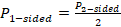
Fisher’s method combines the P values from statistical tests across k studies using the formula:
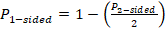
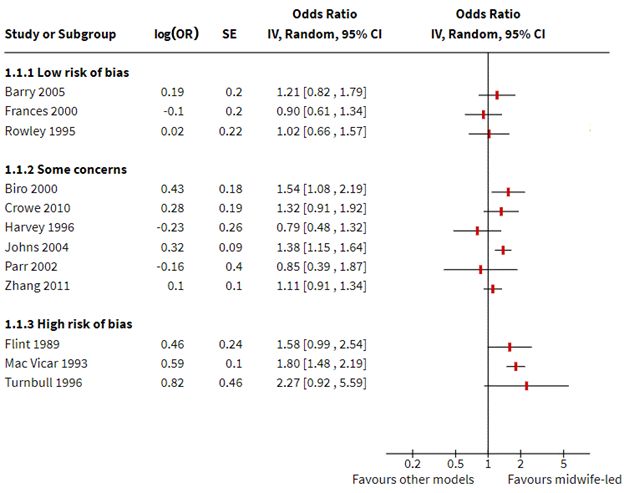
One-sided P values are used, since these contain information about the direction of effect. However, these P values must reflect the same directional hypothesis (e.g. all testing if intervention A is more effective than intervention B). This is analogous to standardizing the direction of effects before undertaking a meta-analysis. Two-sided P values, which do not contain information about the direction, must first be converted to one-sided P values. If the effect is consistent with the directional hypothesis (e.g. intervention A is beneficial compared with B), then the one-sided P value is calculated as
 ;
;
otherwise,
 .
.
In studies that do not report an exact P value but report a conventional level of significance (e.g. P<0.05), a conservative option is to use the threshold (e.g. 0.05). The P values must have been computed from statistical tests that appropriately account for the features of the design, such as clustering or matching, otherwise they will likely be incorrect.
The Chi2 statistic will follow a chi-squared distribution with  degrees of freedom if there is no effect in every study. A large Chi2 statistic compared to the degrees of freedom (with a corresponding low P value) provides evidence of an effect in at least one study (see Section 12.4.2.2 for guidance on implementing Fisher’s method for combining P values).
Reporting of methods and results There are several methods for combining P values (Loughin 2004), so the chosen method should be reported, along with details of sensitivity analyses that examine if the results are sensitive to the choice of method. The results from the test should be reported alongside any available effect estimates (either individual results or meta-analysis results of a subset of studies) using text, tabulation and appropriate visual displays (Section 12.3). The albatross plot is likely to complement the analysis (Section 12.3.4). Limitations of the method should be acknowledged (Table 12.2.a).
12.2.1.3 Vote counting based on the direction of effect
Description of method Vote counting based on the direction of effect might be considered in the circumstance where the direction of effect is reported (with no further information), or there is no consistent effect measure or data reported across studies. The essence of vote counting is to compare the number of effects showing benefit to the number of effects showing harm for a particular outcome. However, there is wide variation in the implementation of the method due to differences in how ‘benefit’ and ‘harm’ are defined. Rules based on subjective decisions or statistical significance are problematic and should be avoided (see Section 12.2.2).
To undertake vote counting properly, each effect estimate is first categorized as showing benefit or harm based on the observed direction of effect alone, thereby creating a standardized binary metric. A count of the number of effects showing benefit is then compared with the number showing harm. Neither statistical significance nor the size of the effect are considered in the categorization. A sign test can be used to answer the question ‘is there any evidence of an effect?’ If there is no effect, the study effects will be distributed evenly around the null hypothesis of no difference. This is equivalent to testing if the true proportion of effects favouring the intervention (or comparator) is equal to 0.5 (Bushman and Wang 2009) (see Section 12.4.2.3 for guidance on implementing the sign test). An estimate of the proportion of effects favouring the intervention can be calculated (p = u/n, where u = number of effects favouring the intervention, and n = number of studies) along with a confidence interval (e.g. using the Wilson or Jeffreys interval methods (Brown et al 2001)). Unless there are many studies contributing effects to the analysis, there will be large uncertainty in this estimated proportion.
Reporting of methods and results The vote counting method should be reported in the ‘Data synthesis’ section of the review. Failure to recognize vote counting as a synthesis method has led to it being applied informally (and perhaps unintentionally) to summarize results (e.g. through the use of wording such as ‘3 of 10 studies showed improvement in the outcome with intervention compared to control’; ‘most studies found’; ‘the majority of studies’; ‘few studies’ etc). In such instances, the method is rarely reported, and it may not be possible to determine whether an unacceptable (invalid) rule has been used to define benefit and harm (Section 12.2.2). The results from vote counting should be reported alongside any available effect estimates (either individual results or meta-analysis results of a subset of studies) using text, tabulation and appropriate visual displays (Section 12.3). The number of studies contributing to a synthesis based on vote counting may be larger than a meta-analysis, because only minimal statistical information (i.e. direction of effect) is required from each study to vote count. Vote counting results are used to derive the harvest and effect direction plots, although often using unacceptable methods of vote counting (see Section 12.3.5). Limitations of the method should be acknowledged (Table 12.2.a).
12.2.2 Unacceptable synthesis methods
12.2.2.1 Vote counting based on statistical significance
Conventional forms of vote counting use rules based on statistical significance and direction to categorize effects. For example, effects may be categorized into three groups: those that favour the intervention and are statistically significant (based on some predefined P value), those that favour the comparator and are statistically significant, and those that are statistically non-significant (Hedges and Vevea 1998). In a simpler formulation, effects may be categorized into two groups: those that favour the intervention and are statistically significant, and all others (Friedman 2001). Regardless of the specific formulation, when based on statistical significance, all have serious limitations and can lead to the wrong conclusion.
The conventional vote counting method fails because underpowered studies that do not rule out clinically important effects are counted as not showing benefit. Suppose, for example, the effect sizes estimated in two studies were identical. However, only one of the studies was adequately powered, and the effect in this study was statistically significant. Only this one effect (of the two identical effects) would be counted as showing ‘benefit’. Paradoxically, Hedges and Vevea showed that as the number of studies increases, the power of conventional vote counting tends to zero, except with large studies and at least moderate intervention effects (Hedges and Vevea 1998). Further, conventional vote counting suffers the same disadvantages as vote counting based on direction of effect, namely, that it does not provide information on the magnitude of effects and does not account for differences in the relative sizes of the studies.
12.2.2.2 Vote counting based on subjective rules
Subjective rules, involving a combination of direction, statistical significance and magnitude of effect, are sometimes used to categorize effects. For example, in a review examining the effectiveness of interventions for teaching quality improvement to clinicians, the authors categorized results as ‘beneficial effects’, ‘no effects’ or ‘detrimental effects’ (Boonyasai et al 2007). Categorization was based on direction of effect and statistical significance (using a predefined P value of 0.05) when available. If statistical significance was not reported, effects greater than 10% were categorized as ‘beneficial’ or ‘detrimental’, depending on their direction. These subjective rules often vary in the elements, cut-offs and algorithms used to categorize effects, and while detailed descriptions of the rules may provide a veneer of legitimacy, such rules have poor performance validity (Ioannidis et al 2008).
A further problem occurs when the rules are not described in sufficient detail for the results to be reproduced (e.g. ter Wee et al 2012, Thornicroft et al 2016). This lack of transparency does not allow determination of whether an acceptable or unacceptable vote counting method has been used (Valentine et al 2010).
12.3 Visual display and presentation of the data
Visual display and presentation of data is especially important for transparent reporting in reviews without meta-analysis, and should be considered irrespective of whether synthesis is undertaken (see Table 12.2.a for a summary of plots associated with each synthesis method). Tables and plots structure information to show patterns in the data and convey detailed information more efficiently than text. This aids interpretation and helps readers assess the veracity of the review findings.
12.3.1 Structured tabulation of results across studies
Ordering studies alphabetically by study ID is the simplest approach to tabulation; however, more information can be conveyed when studies are grouped in subpanels or ordered by a characteristic important for interpreting findings. The grouping of studies in tables should generally follow the structure of the synthesis presented in the text, which should closely reflect the review questions. This grouping should help readers identify the data on which findings are based and verify the review authors’ interpretation.
If the purpose of the table is comparative, grouping studies by any of following characteristics might be informative:
- comparisons considered in the review, or outcome domains (according to the structure of the synthesis);
- study characteristics that may reveal patterns in the data, for example potential effect modifiers including population subgroups, settings or intervention components.
If the purpose of the table is complete and transparent reporting of data, then ordering the studies to increase the prominence of the most relevant and trustworthy evidence should be considered. Possibilities include:
- certainty of the evidence (synthesized result or individual studies if no synthesis);
- risk of bias, study size or study design characteristics; and
- characteristics that determine how directly a study addresses the review question, for example relevance and validity of the outcome measures.
One disadvantage of grouping by study characteristics is that it can be harder to locate specific studies than when tables are ordered by study ID alone, for example when cross-referencing between the text and tables. Ordering by study ID within categories may partly address this.
The value of standardizing intervention and outcome labels is discussed in Chapter 3, Section 3.2.2 and Section 3.2.4), while the importance and methods for standardizing effect estimates is described in Chapter 6. These practices can aid readers’ interpretation of tabulated data, especially when the purpose of a table is comparative.
12.3.2 Forest plots
Forest plots and methods for preparing them are described elsewhere (Chapter 10, Section 10.2). Some mention is warranted here of their importance for displaying study results when meta-analysis is not undertaken (i.e. without the summary diamond). Forest plots can aid interpretation of individual study results and convey overall patterns in the data, especially when studies are ordered by a characteristic important for interpreting results (e.g. dose and effect size, sample size). Similarly, grouping studies in subpanels based on characteristics thought to modify effects, such as population subgroups, variants of an intervention, or risk of bias, may help explore and explain differences across studies (Schriger et al 2010). These approaches to ordering provide important techniques for informally exploring heterogeneity in reviews without meta-analysis, and should be considered in preference to alphabetical ordering by study ID alone (Schriger et al 2010).
12.3.3 Box-and-whisker plots and bubble plots
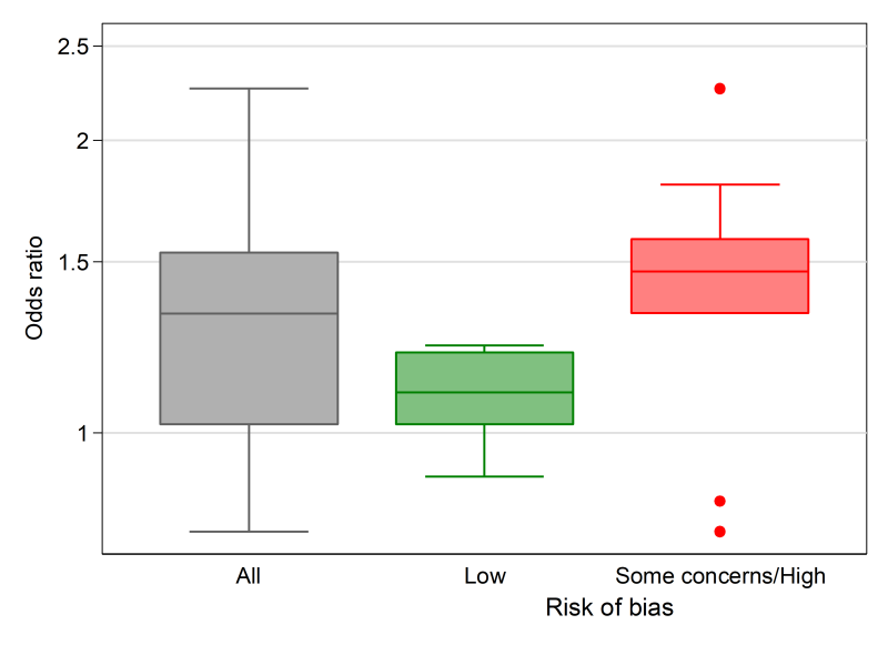
Box-and-whisker plots (see Figure 12.4.a, Panel A) provide a visual display of the distribution of effect estimates (Section 12.2.1.1). The plot conventionally depicts five values. The upper and lower limits (or ‘hinges’) of the box, represent the 75th and 25th percentiles, respectively. The line within the box represents the 50th percentile (median), and the whiskers represent the extreme values (McGill et al 1978). Multiple box plots can be juxtaposed, providing a visual comparison of the distributions of effect estimates (Schriger et al 2006). For example, in a review examining the effects of audit and feedback on professional practice, the format of the feedback (verbal, written, both verbal and written) was hypothesized to be an effect modifier (Ivers et al 2012). Box-and-whisker plots of the risk differences were presented separately by the format of feedback, to allow visual comparison of the impact of format on the distribution of effects. When presenting multiple box-and-whisker plots, the width of the box can be varied to indicate the number of studies contributing to each. The plot’s common usage facilitates rapid and correct interpretation by readers (Schriger et al 2010). The individual studies contributing to the plot are not identified (as in a forest plot), however, and the plot is not appropriate when there are few studies (Schriger et al 2006).
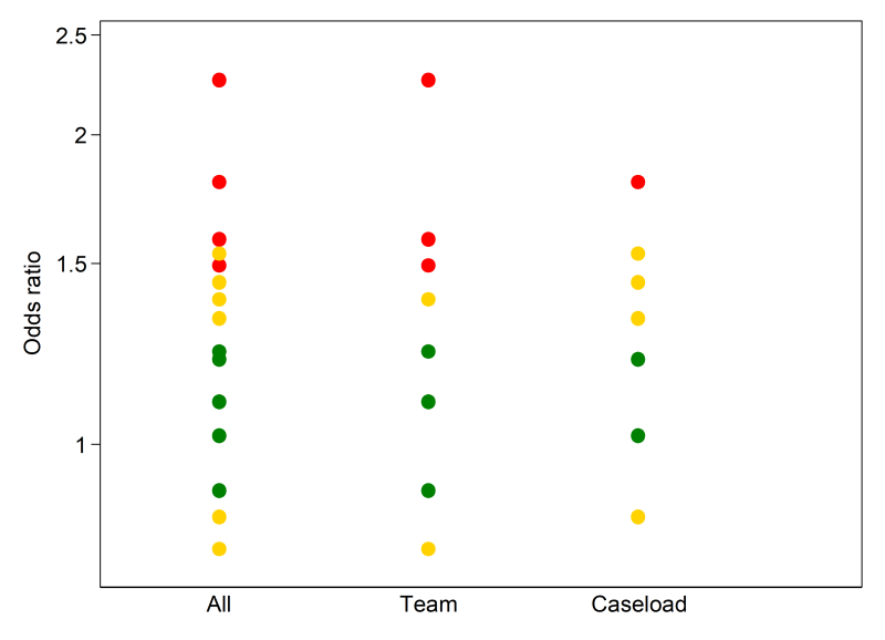
A bubble plot (see Figure 12.4.a, Panel B) can also be used to provide a visual display of the distribution of effects, and is more suited than the box-and-whisker plot when there are few studies (Schriger et al 2006). The plot is a scatter plot that can display multiple dimensions through the location, size and colour of the bubbles. In a review examining the effects of educational outreach visits on professional practice, a bubble plot was used to examine visually whether the distribution of effects was modified by the targeted behaviour (O’Brien et al 2007). Each bubble represented the effect size (y-axis) and whether the study targeted a prescribing or other behaviour (x-axis). The size of the bubbles reflected the number of study participants. However, different formulations of the bubble plot can display other characteristics of the data (e.g. precision, risk-of-bias assessments).
12.3.4 Albatross plot
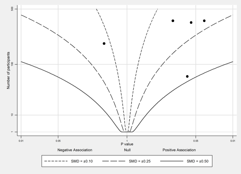
The albatross plot (see Figure 12.4.a, Panel C) allows approximate examination of the underlying intervention effect sizes where there is minimal reporting of results within studies (Harrison et al 2017). The plot only requires a two-sided P value, sample size and direction of effect (or equivalently, a one-sided P value and a sample size) for each result. The plot is a scatter plot of the study sample sizes against two-sided P values, where the results are separated by the direction of effect. Superimposed on the plot are ‘effect size contours’ (inspiring the plot’s name). These contours are specific to the type of data (e.g. continuous, binary) and statistical methods used to calculate the P values. The contours allow interpretation of the approximate effect sizes of the studies, which would otherwise not be possible due to the limited reporting of the results. Characteristics of studies (e.g. type of study design) can be identified using different colours or symbols, allowing informal comparison of subgroups.
The plot is likely to be more inclusive of the available studies than meta-analysis, because of its minimal data requirements. However, the plot should complement the results from a statistical synthesis, ideally a meta-analysis of available effects.
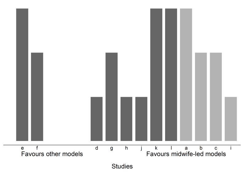
12.3.5 Harvest and effect direction plots
Harvest plots (see Figure 12.4.a, Panel D) provide a visual extension of vote counting results (Ogilvie et al 2008). In the plot, studies based on the categorization of their effects (e.g. ‘beneficial effects’, ‘no effects’ or ‘detrimental effects’) are grouped together. Each study is represented by a bar positioned according to its categorization. The bars can be ‘visually weighted’ (by height or width) and annotated to highlight study and outcome characteristics (e.g. risk-of-bias domains, proximal or distal outcomes, study design, sample size) (Ogilvie et al 2008, Crowther et al 2011). Annotation can also be used to identify the studies. A series of plots may be combined in a matrix that displays, for example, the vote counting results from different interventions or outcome domains.
The methods papers describing harvest plots have employed vote counting based on statistical significance (Ogilvie et al 2008, Crowther et al 2011). For the reasons outlined in Section 12.2.2.1, this can be misleading. However, an acceptable approach would be to display the results based on direction of effect.
The effect direction plot is similar in concept to the harvest plot in the sense that both display information on the direction of effects (Thomson and Thomas 2013). In the first version of the effect direction plot, the direction of effects for each outcome within a single study are displayed, while the second version displays the direction of the effects for outcome domains across studies. In this second version, an algorithm is first applied to ‘synthesize’ the directions of effect for all outcomes within a domain (e.g. outcomes ‘sleep disturbed by wheeze’, ‘wheeze limits speech’, ‘wheeze during exercise’ in the outcome domain ‘respiratory’). This algorithm is based on the proportion of effects that are in a consistent direction and statistical significance. Arrows are used to indicate the reported direction of effect (for either outcomes or outcome domains). Features such as statistical significance, study design and sample size are denoted using size and colour. While this version of the plot conveys a large amount of information, it requires further development before its use can be recommended since the algorithm underlying the plot is likely to have poor performance validity.
12.4 Worked example
The example that follows uses four scenarios to illustrate methods for presentation and synthesis when meta-analysis is not possible. The first scenario contrasts a common approach to tabulation with alternative presentations that may enhance the transparency of reporting and interpretation of findings. Subsequent scenarios show the application of the synthesis approaches outlined in preceding sections of the chapter. Box 12.4.a summarizes the review comparisons and outcomes, and decisions taken by the review authors in planning their synthesis. While the example is loosely based on an actual review, the review description, scenarios and data are fabricated for illustration.
Box 12.4.a The review
|
The review used in this example examines the effects of midwife-led continuity models versus other models of care for childbearing women. One of the outcomes considered in the review, and of interest to many women choosing a care option, is maternal satisfaction with care. The review included 15 randomized trials, all of which reported a measure of satisfaction. Overall, 32 satisfaction outcomes were reported, with between one and 11 outcomes reported per study. There were differences in the concepts measured (e.g. global satisfaction; specific domains such as of satisfaction with information), the measurement period (i.e. antenatal, intrapartum, postpartum care), and the measurement tools (different scales; variable evidence of validity and reliability).
Before conducting their synthesis, the review authors did the following.
|
12.4.1 Scenario 1: structured reporting of effects
We first address a scenario in which review authors have decided that the tools used to measure satisfaction measured concepts that were too dissimilar across studies for synthesis to be appropriate. Setting aside three of the 15 studies that reported on the birth partner’s satisfaction with care, a structured summary of effects is sought of the remaining 12 studies. To keep the example table short, only one outcome is shown per study for each of the measurement periods (antenatal, intrapartum or postpartum).
Table 12.4.a depicts a common yet suboptimal approach to presenting results. Note two features.
- Studies are ordered by study ID, rather than grouped by characteristics that might enhance interpretation (e.g. risk of bias, study size, validity of the measures, certainty of the evidence (GRADE)).
- Data reported are as extracted from each study; effect estimates were not calculated by the review authors and, where reported, were not standardized across studies (although data were available to do both).
Table 12.4.b shows an improved presentation of the same results. In line with best practice, here effect estimates have been calculated by the review authors for all outcomes, and a common metric computed to aid interpretation (in this case an odds ratio; see Chapter 6 for guidance on conversion of statistics to the desired format). Redundant information has been removed (‘statistical test’ and ‘P value’ columns). The studies have been re-ordered, first to group outcomes by period of care (intrapartum outcomes are shown here), and then by risk of bias. This re-ordering serves two purposes. Grouping by period of care aligns with the plan to consider outcomes for each period separately and ensures the table structure matches the order in which results are described in the text. Re-ordering by risk of bias increases the prominence of studies at lowest risk of bias, focusing attention on the results that should most influence conclusions. Had the review authors determined that a synthesis would be informative, then ordering to facilitate comparison across studies would be appropriate; for example, ordering by the type of satisfaction outcome (as pre-defined in the protocol, starting with global measures of satisfaction), or the comparisons made in the studies.
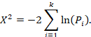
The results may also be presented in a forest plot, as shown in Figure 12.4.b. In both the table and figure, studies are grouped by risk of bias to focus attention on the most trustworthy evidence. The pattern of effects across studies is immediately apparent in Figure 12.4.b and can be described efficiently without having to interpret each estimate (e.g. difference between studies at low and high risk of bias emerge), although these results should be interpreted with caution in the absence of a formal test for subgroup differences (see Chapter 10, Section 10.11). Only outcomes measured during the intrapartum period are displayed, although outcomes from other periods could be added, maximizing the information conveyed.
An example description of the results from Scenario 1 is provided in Box 12.4.b. It shows that describing results study by study becomes unwieldy with more than a few studies, highlighting the importance of tables and plots. It also brings into focus the risk of presenting results without any synthesis, since it seems likely that the reader will try to make sense of the results by drawing inferences across studies. Since a synthesis was considered inappropriate, GRADE was applied to individual studies and then used to prioritize the reporting of results, focusing attention on the most relevant and trustworthy evidence. An alternative might be to report results at low risk of bias, an approach analogous to limiting a meta-analysis to studies at low risk of bias. Where possible, these and other approaches to prioritizing (or ordering) results from individual studies in text and tables should be pre-specified at the protocol stage.
Table 12.4.a Scenario 1: table ordered by study ID, data as reported by study authors
|
Outcome (scale details*) |
Intervention |
Control |
Effect estimate (metric) |
95% CI |
Statistical test |
P value |
|
Barry 2005 |
% (N) |
% (N) |
||||
|
Experience of labour |
37% (246) |
32% (223) |
5% (RD) |
P > 0.05 |
||
|
Biro 2000 |
n/N |
n/N |
||||
|
Perception of care: labour/birth |
260/344 |
192/287 |
1.13 (RR) |
1.02 to 1.25 |
z = 2.36 |
0.018 |
|
Crowe 2010 |
Mean (SD) N |
Mean (SD) N |
||||
|
Experience of antenatal care (0 to 24 points) |
21.0 (5.6) 182 |
19.7 (7.3) 186 |
1.3 (MD) |
–0.1 to 2.7 |
t = 1.88 |
0.061 |
|
Experience of labour/birth (0 to 18 points) |
9.8 (3.1) 182 |
9.3 (3.3) 186 |
0.5 (MD) |
–0.2 to 1.2 |
t = 1.50 |
0.135 |
|
Experience of postpartum care (0 to 18 points) |
11.7 (2.9) 182 |
10.9 (4.2) 186 |
0.8 (MD) |
0.1 to 1.5 |
t = 2.12 |
0.035 |
|
Flint 1989 |
n/N |
n/N |
||||
|
Care from staff during labour |
240/275 |
208/256 |
1.07 (RR) |
1.00 to 1.16 |
z = 1.89 |
0.059 |
|
Frances 2000 |
||||||
|
Communication: labour/birth |
0.90 (OR) |
0.61 to 1.33 |
z = –0.52 |
0.606 |
||
|
Harvey 1996 |
Mean (SD) N |
Mean (SD) N |
||||
|
Labour & Delivery Satisfaction Index |
182 (14.2) 101 |
185 (30) 93 |
t = –0.90 for MD |
0.369 for MD |
||
|
Johns 2004 |
n/N |
n/N |
||||
|
Satisfaction with intrapartum care |
605/1163 |
363/826 |
8.1% (RD) |
3.6 to 12.5 |
< 0.001 |
|
|
Mac Vicar 1993 |
n/N |
n/N |
||||
|
Birth satisfaction |
849/1163 |
496/826 |
13.0% (RD) |
8.8 to 17.2 |
z = 6.04 |
0.000 |
|
Parr 2002 |
||||||
|
Experience of childbirth |
0.85 (OR) |
0.39 to 1.86 |
z = -0.41 |
0.685 |
||
|
Rowley 1995 |
||||||
|
Encouraged to ask questions |
1.02 (OR) |
0.66 to 1.58 |
z = 0.09 |
0.930 |
||
|
Turnbull 1996 |
Mean (SD) N |
Mean (SD) N |
||||
|
Intrapartum care rating (–2 to 2 points) |
1.2 (0.57) 35 |
0.93 (0.62) 30 |
P > 0.05 |
|||
|
Zhang 2011 |
N |
N |
||||
|
Perception of antenatal care |
359 |
322 |
1.23 (POR) |
0.68 to 2.21 |
z = 0.69 |
0.490 |
|
Perception of care: labour/birth |
355 |
320 |
1.10 (POR) |
0.91 to 1.34 |
z = 0.95 |
0.341 |
* All scales operate in the same direction; higher scores indicate greater satisfaction.
CI = confidence interval; MD = mean difference; OR = odds ratio; POR = proportional odds ratio; RD = risk difference; RR = risk ratio.
Table 12.4.b Scenario 1: intrapartum outcome table ordered by risk of bias, standardized effect estimates calculated for all studies
|
Outcome* (scale details) |
Intervention |
Control |
Mean difference (95% CI)** |
Odds ratio |
|
Low risk of bias |
||||
|
Barry 2005 |
n/N |
n/N |
||
|
Experience of labour |
90/246 |
72/223 |
1.21 (0.82 to 1.79) |
|
|
Frances 2000 |
n/N |
n/N |
||
|
Communication: labour/birth |
0.90 (0.61 to 1.34) |
|||
|
Rowley 1995 |
n/N |
n/N |
||
|
Encouraged to ask questions [during labour/birth] |
1.02 (0.66 to 1.58) |
|||
|
Some concerns |
||||
|
Biro 2000 |
n/N |
n/N |
||
|
Perception of care: labour/birth |
260/344 |
192/287 |
1.54 (1.08 to 2.19) |
|
|
Crowe 2010 |
Mean (SD) N |
Mean (SD) N |
||
|
Experience of labour/birth (0 to 18 points) |
9.8 (3.1) 182 |
9.3 (3.3) 186 |
0.5 (–0.15 to 1.15) |
1.32 (0.91 to 1.92) |
|
Harvey 1996 |
Mean (SD) N |
Mean (SD) N |
||
|
Labour & Delivery Satisfaction Index |
182 (14.2) 101 |
185 (30) 93 |
–3 (–10 to 4) |
0.79 (0.48 to 1.32) |
|
Johns 2004 |
n/N |
n/N |
||
|
Satisfaction with intrapartum care |
605/1163 |
363/826 |
1.38 (1.15 to 1.64) |
|
|
Parr 2002 |
n/N |
n/N |
||
|
Experience of childbirth |
0.85 (0.39 to 1.87) |
|||
|
Zhang 2011 |
n/N |
n/N |
||
|
Perception of care: labour and birth |
N = 355 |
N = 320 |
POR 1.11 (0.91 to 1.34) |
|
|
High risk of bias |
||||
|
Flint 1989 |
n/N |
n/N |
||
|
Care from staff during labour |
240/275 |
208/256 |
1.58 (0.99 to 2.54) |
|
|
Mac Vicar 1993 |
n/N |
n/N |
||
|
Birth satisfaction |
849/1163 |
496/826 |
1.80 (1.48 to 2.19) |
|
|
Turnbull 1996 |
Mean (SD) N |
Mean (SD) N |
||
|
Intrapartum care rating (–2 to 2 points) |
1.2 (0.57) 35 |
0.93 (0.62) 30 |
0.27 (–0.03 to 0.57) |
2.27 (0.92 to 5.59) |
* Outcomes operate in the same direction. A higher score, or an event, indicates greater satisfaction.
** Mean difference calculated for studies reporting continuous outcomes.
† For binary outcomes, odds ratios were calculated from the reported summary statistics or were directly extracted from the study. For continuous outcomes, standardized mean differences were calculated and converted to odds ratios (see Chapter 6).
CI = confidence interval; POR = proportional odds ratio.
Figure 12.4.b Forest plot depicting standardized effect estimates (odds ratios) for satisfaction
Box 12.4.b How to describe the results from this structured summary
|
Scenario 1. Structured reporting of effects (no synthesis)
Table 12.4.b and Figure 12.4.b present results for the 12 included studies that reported a measure of maternal satisfaction with care during labour and birth (hereafter ‘satisfaction’). Results from these studies were not synthesized for the reasons reported in the data synthesis methods. Here, we summarize results from studies providing high or moderate certainty evidence (based on GRADE) for which results from a valid measure of global satisfaction were available. Barry 2015 found a small increase in satisfaction with midwife-led care compared to obstetrician-led care (4 more women per 100 were satisfied with care; 95% CI 4 fewer to 15 more per 100 women; 469 participants, 1 study; moderate certainty evidence). Harvey 1996 found a small possibly unimportant decrease in satisfaction with midwife-led care compared with obstetrician-led care (3-point reduction on a 185-point LADSI scale, higher scores are more satisfied; 95% CI 10 points lower to 4 higher; 367 participants, 1 study; moderate certainty evidence). The remaining 10 studies reported specific aspects of satisfaction (Frances 2000, Rowley 1995, …), used tools with little or no evidence of validity and reliability (Parr 2002, …) or provided low or very low certainty evidence (Turnbull 1996, …). Note: While it is tempting to make statements about consistency of effects across studies (…the majority of studies showed improvement in …, X of Y studies found …), be aware that this may contradict claims that a synthesis is inappropriate and constitute unintentional vote counting. |
12.4.2 Overview of scenarios 2–4: synthesis approaches
We now address three scenarios in which review authors have decided that the outcomes reported in the 15 studies all broadly reflect satisfaction with care. While the measures were quite diverse, a synthesis is sought to help decision makers understand whether women and their birth partners were generally more satisfied with the care received in midwife-led continuity models compared with other models. The three scenarios differ according to the data available (see Table 12.4.c), with each reflecting progressively less complete reporting of the effect estimates. The data available determine the synthesis method that can be applied.
- Scenario 2: effect estimates available without measures of precision (illustrating synthesis of summary statistics).
- Scenario 3: P values available (illustrating synthesis of P values).
- Scenario 4: directions of effect available (illustrating synthesis using vote-counting based on direction of effect).
For studies that reported multiple satisfaction outcomes, one result is selected for synthesis using the decision rules in Box 12.4.a (point 2).
Table 12.4.c Scenarios 2, 3 and 4: available data for the selected outcome from each study
|
Scenario 2. Summary statistics |
Scenario 3. Combining P values |
Scenario 4. Vote counting |
||||||
|
Study ID |
Outcome (scale details*) |
Overall RoB judgement |
Available data** |
Stand. metric OR (SMD) |
Available data** (2-sided P value) |
Stand. metric (1-sided P value) |
Available data** |
Stand. metric |
|
Continuous |
Mean (SD) |
|||||||
|
Crowe 2010 |
Expectation of labour/birth (0 to 18 points) |
Some concerns |
Intervention 9.8 (3.1); Control 9.3 (3.3) |
1.3 (0.16) |
Favours intervention, |
0.068 |
NS |
— |
|
Finn 1997 |
Experience of labour/birth (0 to 24 points) |
Some concerns |
Intervention 21 (5.6); Control 19.7 (7.3) |
1.4 (0.20) |
Favours intervention, |
0.030 |
MD 1.3, NS |
1 |
|
Harvey 1996 |
Labour & Delivery Satisfaction Index (37 to 222 points) |
Some concerns |
Intervention 182 (14.2); Control 185 (30) |
0.8 (–0.13) |
MD –3, P = 0.368, N = 194 |
0.816 |
MD –3, NS |
0 |
|
Kidman 2007 |
Control during labour/birth (0 to 18 points) |
High |
Intervention 11.7 (2.9); Control 10.9 (4.2) |
1.5 (0.22) |
MD 0.8, P = 0.035, N = 368 |
0.017 |
MD 0.8 (95% CI 0.1 to 1.5) |
1 |
|
Turnbull 1996 |
Intrapartum care rating (–2 to 2 points) |
High |
Intervention 1.2 (0.57); Control 0.93 (0.62) |
2.3 (0.45) |
MD 0.27, P = 0.072, N = 65 |
0.036 |
MD 0.27 (95% CI0.03 to 0.57) |
1 |
|
Binary |
||||||||
|
Barry 2005 |
Experience of labour |
Low |
Intervention 90/246; |
1.21 |
NS |
— |
RR 1.13, NS |
1 |
|
Biro 2000 |
Perception of care: labour/birth |
Some concerns |
Intervention 260/344; |
1.53 |
RR 1.13, P = 0.018 |
0.009 |
RR 1.13, P < 0.05 |
1 |
|
Flint 1989 |
Care from staff during labour |
High |
Intervention 240/275; |
1.58 |
Favours intervention, |
0.029 |
RR 1.07 (95% CI 1.00 to 1.16) |
1 |
|
Frances 2000 |
Communication: labour/birth |
Low |
OR 0.90 |
0.90 |
Favours control, |
0.697 |
Favours control, NS |
0 |
|
Johns 2004 |
Satisfaction with intrapartum care |
Some concerns |
Intervention 605/1163; |
1.38 |
Favours intervention, |
0.0005 |
RD 8.1% (95% CI 3.6% to 12.5%) |
1 |
|
Mac Vicar 1993 |
Birth satisfaction |
High |
OR 1.80, P < 0.001 |
1.80 |
Favours intervention, |
0.0005 |
RD 13.0% (95% CI 8.8% to 17.2%) |
1 |
|
Parr 2002 |
Experience of childbirth |
Some concerns |
OR 0.85 |
0.85 |
OR 0.85, P = 0.685 |
0.658 |
NS |
— |
|
Rowley 1995 |
Encouraged to ask questions |
Low |
OR 1.02, NS |
1.02 |
P = 0.685 |
— |
NS |
— |
|
Ordinal |
||||||||
|
Waldenstrom 2001 |
Perception of intrapartum care |
Low |
POR 1.23, P = 0.490 |
1.23 |
POR 1.23, |
0.245 |
POR 1.23, NS |
1 |
|
Zhang 2011 |
Perception of care: labour/birth |
Low |
POR 1.10, P > 0.05 |
1.10 |
POR 1.1, P = 0.341 |
0.170 |
Favours intervention |
1 |
* All scales operate in the same direction. Higher scores indicate greater satisfaction.
** For a particular scenario, the ‘available data’ column indicates the data that were directly reported, or were calculated from the reported statistics, in terms of: effect estimate, direction of effect, confidence interval, precise P value, or statement regarding statistical significance (either statistically significant, or not).
CI = confidence interval; direction = direction of effect reported or can be calculated; MD = mean difference; NS = not statistically significant; OR = odds ratio; RD = risk difference; RoB = risk of bias; RR = risk ratio; sig. = statistically significant; SMD = standardized mean difference; Stand. = standardized.
12.4.2.1 Scenario 2: summarizing effect estimates
In Scenario 2, effect estimates are available for all outcomes. However, for most studies, a measure of variance is not reported, or cannot be calculated from the available data. We illustrate how the effect estimates may be summarized using descriptive statistics. In this scenario, it is possible to calculate odds ratios for all studies. For the continuous outcomes, this involves first calculating a standardized mean difference, and then converting this to an odds ratio (Chapter 10, Section 10.6). The median odds ratio is 1.32 with an interquartile range of 1.02 to 1.53 (15 studies). Box-and-whisker plots may be used to display these results and examine informally whether the distribution of effects differs by the overall risk-of-bias assessment (Figure 12.4.a, Panel A). However, because there are relatively few effects, a reasonable alternative would be to present bubble plots (Figure 12.4.a, Panel B).
An example description of the results from the synthesis is provided in Box 12.4.c.
Box 12.4.c How to describe the results from this synthesis
|
Scenario 2. Synthesis of summary statistics
‘The median odds ratio of satisfaction was 1.32 for midwife-led models of care compared with other models (interquartile range 1.02 to 1.53; 15 studies). Only five of the 15 effects were judged to be at a low risk of bias, and informal visual examination suggested the size of the odds ratios may be smaller in this group.’ |
12.4.2.2 Scenario 3: combining P values
In Scenario 3, there is minimal reporting of the data, and the type of data and statistical methods and tests vary. However, 11 of the 15 studies provide a precise P value and direction of effect, and a further two report a P value less than a threshold (<0.001) and direction. We use this scenario to illustrate a synthesis of P values. Since the reported P values are two-sided (Table 12.4.c, column 6), they must first be converted to one-sided P values, which incorporate the direction of effect (Table 12.4.c, column 7).
Fisher’s method for combining P values involved calculating the following statistic:

where  is the one-sided P value from study
  , and
, and  is the total number of P values. This formula can be implemented using a standard spreadsheet package. The statistic is then compared against the chi-squared distribution with 26 (
 ) degrees of freedom to obtain the P value. Using a Microsoft Excel spreadsheet, this can be obtained by typing =CHIDIST(82.3, 26) into any cell. In Stata or R, the packages (both named) metap could be used. These packages include a range of methods for combining P values.
The combination of P values suggests there is strong evidence of benefit of midwife-led models of care in at least one study (P < 0.001 from a Chi2 test, 13 studies). Restricting this analysis to those studies judged to be at an overall low risk of bias (sensitivity analysis), there is no longer evidence to reject the null hypothesis of no benefit of midwife-led model of care in any studies (P = 0.314, 3 studies). For the five studies reporting continuous satisfaction outcomes, sufficient data (precise P value, direction, total sample size) are reported to construct an albatross plot (Figure 12.4.a, Panel C). The location of the points relative to the standardized mean difference contours indicate that the likely effects of the intervention in these studies are small.
An example description of the results from the synthesis is provided in Box 12.4.d.
Box 12.4.d How to describe the results from this synthesis
|
Scenario 3. Synthesis of P values
‘There was strong evidence of benefit of midwife-led models of care in at least one study (P < 0.001, 13 studies). However, a sensitivity analysis restricted to studies with an overall low risk of bias suggested there was no effect of midwife-led models of care in any of the trials (P = 0.314, 3 studies). Estimated standardized mean differences for five of the outcomes were small (ranging from –0.13 to 0.45) (Figure 12.4.a, Panel C).’ |
12.4.2.3 Scenario 4: vote counting based on direction of effect
In Scenario 4, there is minimal reporting of the data, and the type of effect measure (when used) varies across the studies (e.g. mean difference, proportional odds ratio). Of the 15 results, only five report data suitable for meta-analysis (effect estimate and measure of precision; Table 12.4.c, column 8), and no studies reported precise P values. We use this scenario to illustrate vote counting based on direction of effect. For each study, the effect is categorized as beneficial or harmful based on the direction of effect (indicated as a binary metric; Table 12.4.c, column 9).
Of the 15 studies, we exclude three because they do not provide information on the direction of effect, leaving 12 studies to contribute to the synthesis. Of these 12, 10 effects favour midwife-led models of care (83%). The probability of observing this result if midwife-led models of care are truly ineffective is 0.039 (from a binomial probability test, or equivalently, the sign test). The 95% confidence interval for the percentage of effects favouring midwife-led care is wide (55% to 95%).
The binomial test can be implemented using standard computer spreadsheet or statistical packages. For example, the two-sided P value from the binomial probability test presented can be obtained from Microsoft Excel by typing =2*BINOM.DIST(2, 12, 0.5, TRUE) into any cell in the spreadsheet. The syntax requires the smaller of the ‘number of effects favouring the intervention’ or ‘the number of effects favouring the control’ (here, the smaller of these counts is 2), the number of effects (here 12), and the null value (true proportion of effects favouring the intervention = 0.5). In Stata, the bitest command could be used (e.g. bitesti 12 10 0.5).
A harvest plot can be used to display the results (Figure 12.4.a, Panel D), with characteristics of the studies represented using different heights and shading. A sensitivity analysis might be considered, restricting the analysis to those studies judged to be at an overall low risk of bias. However, only four studies were judged to be at a low risk of bias (of which, three favoured midwife-led models of care), precluding reasonable interpretation of the count.
An example description of the results from the synthesis is provided in Box 12.4.e.
Box 12.4.e How to describe the results from this synthesis
|
Scenario 4. Synthesis using vote counting based on direction of effects
‘There was evidence that midwife-led models of care had an effect on satisfaction, with 10 of 12 studies favouring the intervention (83% (95% CI 55% to 95%), P = 0.039) (Figure 12.4.a, Panel D). Four of the 12 studies were judged to be at a low risk of bias, and three of these favoured the intervention. The available effect estimates are presented in [review] Table X.’ |
Figure 12.4.a Possible graphical displays of different types of data. (A) Box-and-whisker plots of odds ratios for all outcomes and separately by overall risk of bias. (B) Bubble plot of odds ratios for all outcomes and separately by the model of care. The colours of the bubbles represent the overall risk of bias judgement (green = low risk of bias; yellow = some concerns; red = high risk of bias). (C) Albatross plot of the study sample size against P values (for the five continuous outcomes in Table 12.4.c, column 6). The effect contours represent standardized mean differences. (D) Harvest plot (height depicts overall risk of bias judgement (tall = low risk of bias; medium = some concerns; short = high risk of bias), shading depicts model of care (light grey = caseload; dark grey = team), alphabet characters represent the studies)
|
(A) |
(B) |
|
(C) |
(D) |
12.5 Chapter information
Authors: Joanne E McKenzie, Sue E Brennan
Acknowledgements: Sections of this chapter build on chapter 9 of version 5.1 of the Handbook, with editors Jonathan J Deeks, Julian PT Higgins and Douglas G Altman.
We are grateful to the following for commenting helpfully on earlier drafts: Miranda Cumpston, Jamie Hartmann-Boyce, Tianjing Li, Rebecca Ryan and Hilary Thomson.
Funding: JEM is supported by an Australian National Health and Medical Research Council (NHMRC) Career Development Fellowship (1143429). SEB’s position is supported by the NHMRC Cochrane Collaboration Funding Program.
12.6 References
Achana F, Hubbard S, Sutton A, Kendrick D, Cooper N. An exploration of synthesis methods in public health evaluations of interventions concludes that the use of modern statistical methods would be beneficial. Journal of Clinical Epidemiology 2014; 67: 376–390.
Becker BJ. Combining significance levels. In: Cooper H, Hedges LV, editors. A handbook of research synthesis. New York (NY): Russell Sage; 1994. p. 215–235.
Boonyasai RT, Windish DM, Chakraborti C, Feldman LS, Rubin HR, Bass EB. Effectiveness of teaching quality improvement to clinicians: a systematic review. JAMA 2007; 298: 1023–1037.
Borenstein M, Hedges LV, Higgins JPT, Rothstein HR. Meta-Analysis methods based on direction and p-values. Introduction to Meta-Analysis. Chichester (UK): John Wiley & Sons, Ltd; 2009. pp. 325–330.
Brown LD, Cai TT, DasGupta A. Interval estimation for a binomial proportion. Statistical Science 2001; 16: 101–117.
Bushman BJ, Wang MC. Vote-counting procedures in meta-analysis. In: Cooper H, Hedges LV, Valentine JC, editors. Handbook of Research Synthesis and Meta-Analysis. 2nd ed. New York (NY): Russell Sage Foundation; 2009. p. 207–220.
Crowther M, Avenell A, MacLennan G, Mowatt G. A further use for the Harvest plot: a novel method for the presentation of data synthesis. Research Synthesis Methods 2011; 2: 79–83.
Friedman L. Why vote-count reviews don’t count. Biological Psychiatry 2001; 49: 161–162.
Grimshaw J, McAuley LM, Bero LA, Grilli R, Oxman AD, Ramsay C, Vale L, Zwarenstein M. Systematic reviews of the effectiveness of quality improvement strategies and programmes. Quality and Safety in Health Care 2003; 12: 298–303.
Harrison S, Jones HE, Martin RM, Lewis SJ, Higgins JPT. The albatross plot: a novel graphical tool for presenting results of diversely reported studies in a systematic review. Research Synthesis Methods 2017; 8: 281–289.
Hedges L, Vevea J. Fixed- and random-effects models in meta-analysis. Psychological Methods 1998; 3: 486–504.
Ioannidis JP, Patsopoulos NA, Rothstein HR. Reasons or excuses for avoiding meta-analysis in forest plots. BMJ 2008; 336: 1413–1415.
Ivers N, Jamtvedt G, Flottorp S, Young JM, Odgaard-Jensen J, French SD, O’Brien MA, Johansen M, Grimshaw J, Oxman AD. Audit and feedback: effects on professional practice and healthcare outcomes. Cochrane Database of Systematic Reviews 2012; 6: CD000259.
Jones DR. Meta-analysis: weighing the evidence. Statistics in Medicine 1995; 14: 137–149.
Loughin TM. A systematic comparison of methods for combining p-values from independent tests. Computational Statistics & Data Analysis 2004; 47: 467–485.
McGill R, Tukey JW, Larsen WA. Variations of box plots. The American Statistician 1978; 32: 12–16.
McKenzie JE, Brennan SE. Complex reviews: methods and considerations for summarising and synthesising results in systematic reviews with complexity. Report to the Australian National Health and Medical Research Council. 2014.
O’Brien MA, Rogers S, Jamtvedt G, Oxman AD, Odgaard-Jensen J, Kristoffersen DT, Forsetlund L, Bainbridge D, Freemantle N, Davis DA, Haynes RB, Harvey EL. Educational outreach visits: effects on professional practice and health care outcomes. Cochrane Database of Systematic Reviews 2007; 4: CD000409.
Ogilvie D, Fayter D, Petticrew M, Sowden A, Thomas S, Whitehead M, Worthy G. The harvest plot: a method for synthesising evidence about the differential effects of interventions. BMC Medical Research Methodology 2008; 8: 8.
Riley RD, Higgins JP, Deeks JJ. Interpretation of random effects meta-analyses. BMJ 2011; 342: d549.
Schriger DL, Sinha R, Schroter S, Liu PY, Altman DG. From submission to publication: a retrospective review of the tables and figures in a cohort of randomized controlled trials submitted to the British Medical Journal. Annals of Emergency Medicine 2006; 48: 750–756, 756 e751–721.
Schriger DL, Altman DG, Vetter JA, Heafner T, Moher D. Forest plots in reports of systematic reviews: a cross-sectional study reviewing current practice. International Journal of Epidemiology 2010; 39: 421–429.
ter Wee MM, Lems WF, Usan H, Gulpen A, Boonen A. The effect of biological agents on work participation in rheumatoid arthritis patients: a systematic review. Annals of the Rheumatic Diseases 2012; 71: 161–171.
Thomson HJ, Thomas S. The effect direction plot: visual display of non-standardised effects across multiple outcome domains. Research Synthesis Methods 2013; 4: 95–101.
Thornicroft G, Mehta N, Clement S, Evans-Lacko S, Doherty M, Rose D, Koschorke M, Shidhaye R, O’Reilly C, Henderson C. Evidence for effective interventions to reduce mental-health-related stigma and discrimination. Lancet 2016; 387: 1123–1132.
Valentine JC, Pigott TD, Rothstein HR. How many studies do you need?: a primer on statistical power for meta-analysis. Journal of Educational and Behavioral Statistics 2010; 35: 215–247.